These days, nearly everyone has a smart phone—and each year, more people are shopping on their smart phone, too!
Mobile-friendly parts websites create the foundation for a successful digital parts business. Not only does it make your website look more professional and credible, but it also boosts the chances that a mobile shopper will actually buy. Mobile-friendly stores also drive more traffic, since search engines such as Google heavily favor them.
Is your current parts web store mobile-friendly? Let’s go through some of the common design features that will make your website mobile-friendly.
1. A Simple Homepage
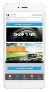
To start, you need a simple and easy-to-navigate homepage that lets users quickly and easily find the information they need.
Ensure you have a highly visible search button at the top of the page. The search feature should be easy to access from other pages on your website, too.
“Simple” also means using large, easily identifiable buttons where users can immediately select the option they are interested in. In the case of your parts website, you’ll want to offer a clear way to search by category or make.
Some RevolutionParts themes let your shoppers tap on a picture of their vehicle brand to quickly jump to parts that fit. You can also set up a “recommended products” section with images or simple labels for several of your top categories.
The ability to tap on an image instead of typing “oil filters” into the search bar really simplifies the process and speeds things up for your shopper.
2. Responsive Design
With a responsive design, visitors can access your website from a variety of devices. Since phones and tablets come in all shapes and sizes, the responsive design is incredibly important to make sure your site looks good everywhere!
RevolutionParts specializes in customizing your website in a way that it automatically detects the users screen size and adjusts the layout accordingly. You can use flexible images and layouts to enhance the visitor’s experience.
3. Priority on the Experience
While you may want to feature high-definition videos, animations, and complex design elements on your desktop website, a simpler approach is better for the mobile version.
This is especially true when these things can confuse site navigation and make the page take longer to load!
RevolutionParts templates are modern and clean with an emphasis on usability. This means websites that offer a shorter load time while retaining the beautiful design elements and imagery that represent your brand.
RELATED: 6 Automotive Industry Trends that we can Expect More of in the Future
4. Flexibility
Parts buyers on your parts website are either looking for a specific item or browsing through different categories looking for something that might interest them. Keep that in mind when you look at designs!
Create a website that caters to both types of visitors from the very beginning. For example, greet customers with the search option and then include category buttons below organized by popularity to simplify navigation.
5. Easy Browsing

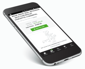
If you have mutliple pictures of the same part, it should be easy to scroll through them to see the wireframe diagram and the part from multiple angles.
RevolutionParts also makes it easy to set up a “Customers Also Bought” section to part pages so your shoppers can easily swipe through related items. It’s convenient for your shoppers, and great for you—the more items they order, the better! Upload images for these parts for maximum success.
Easy browsing also means having a quick response time and fast-loading website. Browsing isn’t “easy” if the shopper has to wait a minute between each page.
6. No Clutter
A mobile screen is much smaller than your desktop screen, so it’s tough to pack all the necessary info in a tiny space. As a result, a lot of mobile sites end up cluttered and complicated.
A well-organized website optimized for mobile can give access to a lot of information in a clear and concise way, allowing users to navigate the page clutter-free. This is a tricky balance to achieve especially when you’re trying to give customers different information such as available parts, tips on how to care for parts or upcoming sales.
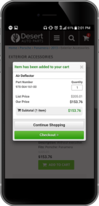
In parts sales, RevolutionParts will de-clutter your mobile-friendly parts website and help you communicate to clients with a simple call-to-action button. This way, you can help shoppers find what they need without overwhelming them.
7. Product Visibility
Potential clients looking for parts on their mobile devices want to see the parts without having to load multiple pages to see different angles of the same item. Mobile phones typically don’t have reliable internet compared to a desktop, so loading so many pages can get time-consuming.
At the same time, pictures are incredibly important! Multiple pictures help shoppers confirm that it’s the part they need.
Instead of opening in the same page, product images on the RevolutionParts platform open up in a small pop-up. This keeps things loading quickly, and makes it easy for a shopper to return to the page. When you add multiple part pictures, customers can tap and swipe on the image for different views. After they’re satisfied, they have easy access to purchase information on the same page.
RELATED: Top 3 Industry Takeaways We’ve Learned on our Journey to $500M in parts sold through RevolutionParts
8. Mobile Optimization for Online Forms
Any type of online selling requires collecting customer data all the time—contact details, shipping info, credit card numbers, and so on. That means your parts website will have a lot of forms.
Unfortunately, a lot of digital forms work great on a desktop, but are hard to use on a mobile phone.
Make sure your mobile forms have large text and buttons so customers don’t have to pinch and zoom. Additionally, look for website designs with easy navigation so customers can review the information they provide instantly, without having to load multiple pages.
10. High-Resolution Images
With the evolution of social media applications such as Instagram, Pinterest, and Facebook, high-resolution images are more important than ever! Mobile devices are no exception.
Your visitors already have high-definition screens, and expect quality images when viewing and shopping for parts online.
The RevolutionParts catalog includes diagram images for a large number of parts, which is good for figuring out where the part fits into a car.
However, an actual product photo is much more visually pleasing to shoppers—they can DOUBLE your conversion rates!
It’s worth it to invest in high quality photography for your inventory to give your customers access to high-resolution images of available products. Don’t worry about uploading an image for every single item in your inventory. To start, just take pictures of your top-selling parts and categories.
Check these out for more tips:
- How to Take Better Auto Part Photos
- Top Tools for Taking Photos of Auto Parts Without Breaking the Bank
Conclusion
Mobile traffic has grown so much over the last few years, and we expect it to just keep getting larger! If you don’t have a mobile-friendly place to sell your parts online, are you really willing to throw away that growing segment of buyers?
Investing in a mobile-friendly parts website is already an essential part of your parts department’s online success. If you currently have a parts website, visit it on your phone and browse through it like a shopper would. Does it meet the standards we listed above?
If you haven’t moved your parts business online yet, keep this in mind when you’re exploring options! And don’t just take a vendor’s word for it. Always check a few parts websites powered by them to make sure they truly are mobile-friendly and easy to use from a phone.


